Buffalo Apartment Living Room and Kitchen Before and After
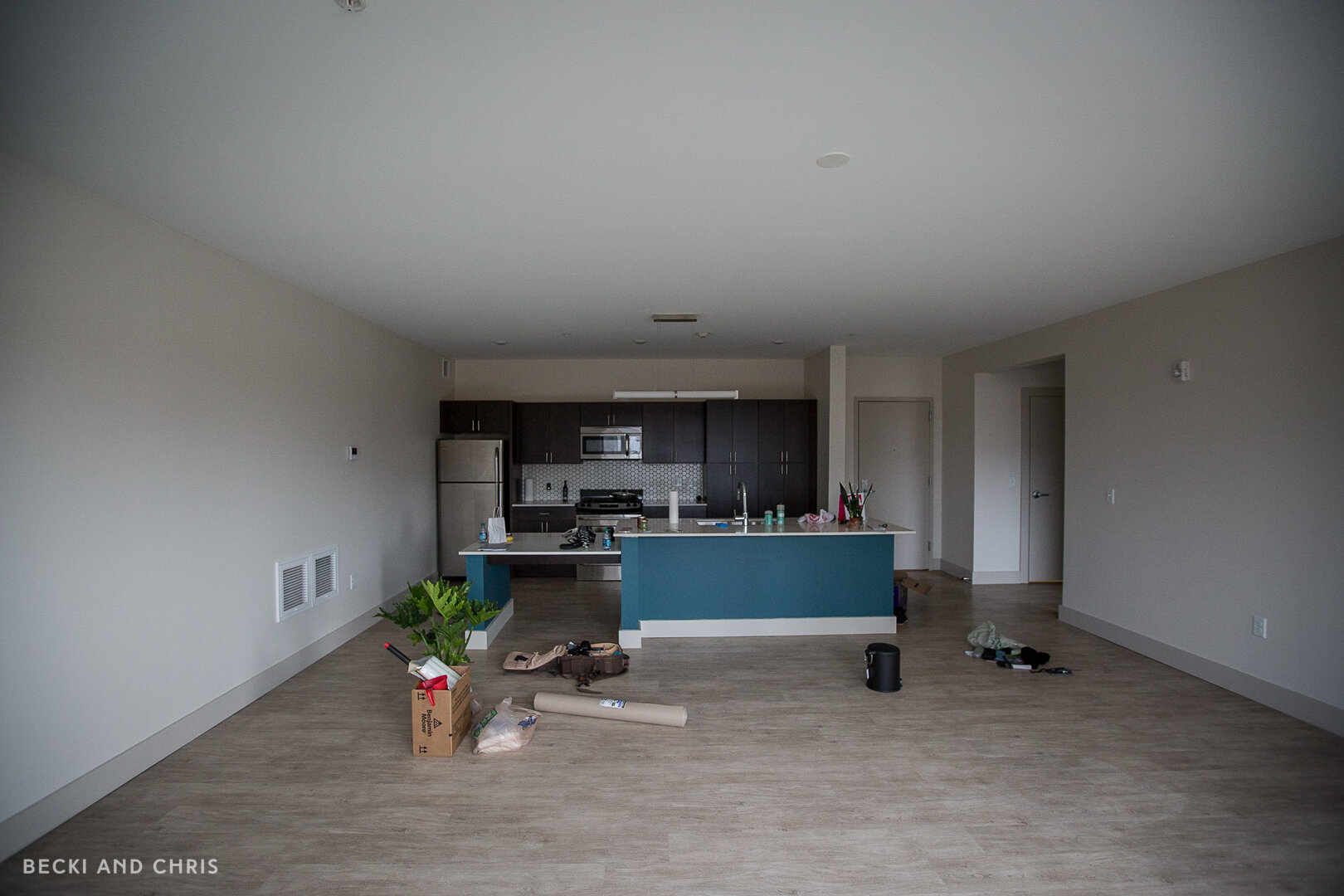
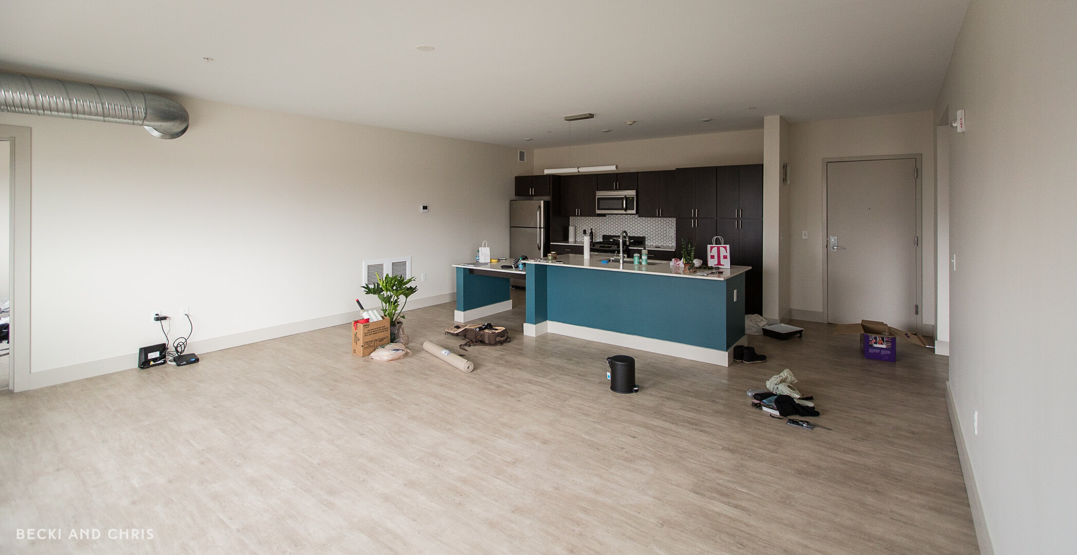
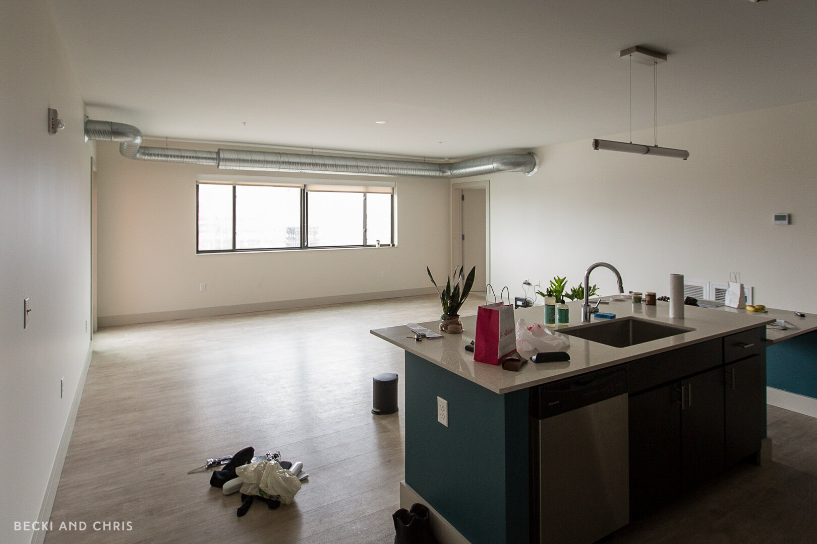
The first time we saw the interior of this apartment was THE DAY WE MOVED IN. Terrifying! But it was three times the size of our Vancouver apartment which was a nice treat! When we moved in the walls were a creamy white and the island was turquoise. If you know us (or follow us on Instagram) you know we aren’t the biggest fans of color in our home so we asked our landlord of we could paint the space, they said YES!
If you saw our Vancouver apartment tour (where we DID go colorful just to try it) you may recognize some of the furniture from that space. The fun thing about moving into a new spot is putting all your furniture and accessories into one room and then shopping your own house. What I mean by that is surveying all your things, seeing what might work in your new space, and then not being afraid to use stuff you once had in the bedroom in the new living room or vice versa. This is why it’s SO important to invest in pieces that you LOVE for your home so you will want to use them over and over again.
If you want to watch the video version of this post you can see it here:
FURNITURE
Black Arc Lamp by EQ3 (not available, this one is an alternative)
Black Floor Lamp by EQ3 (not available, this one is similar)
Mimico Cabinet by Gus Modern (not available, this one is similar)
Wireframe Coffee Table by Gus Modern
Metric End Table by Gus Modern
BEFORE AND AFTER
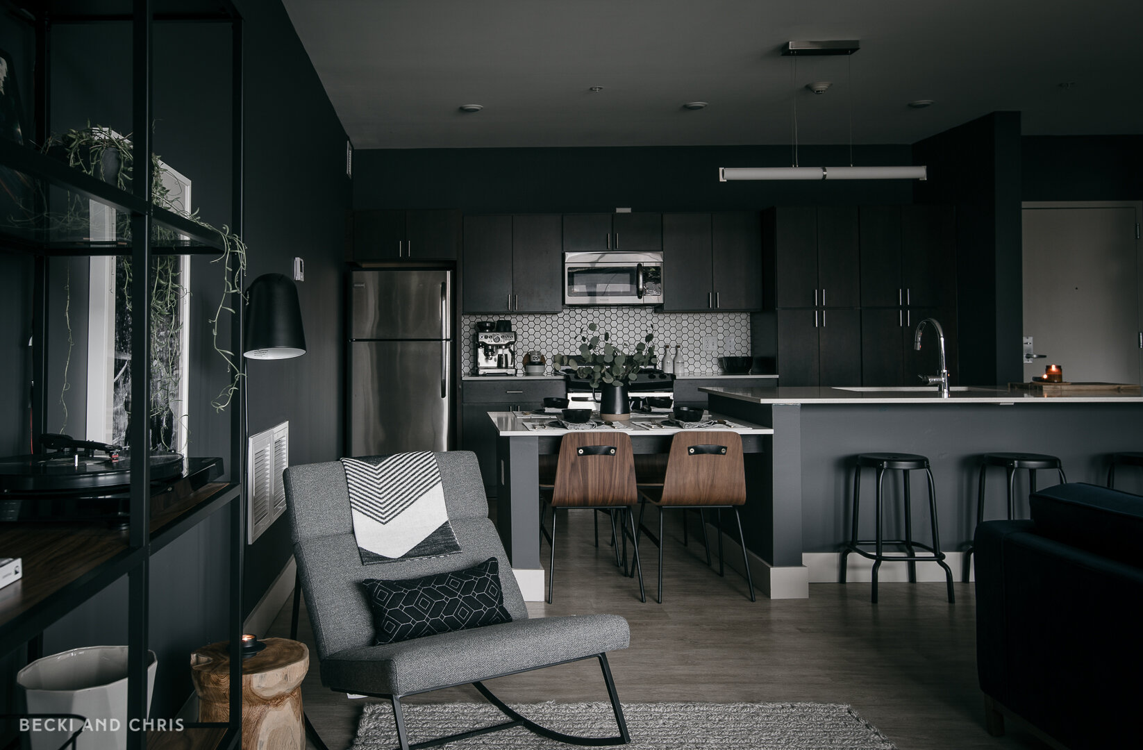
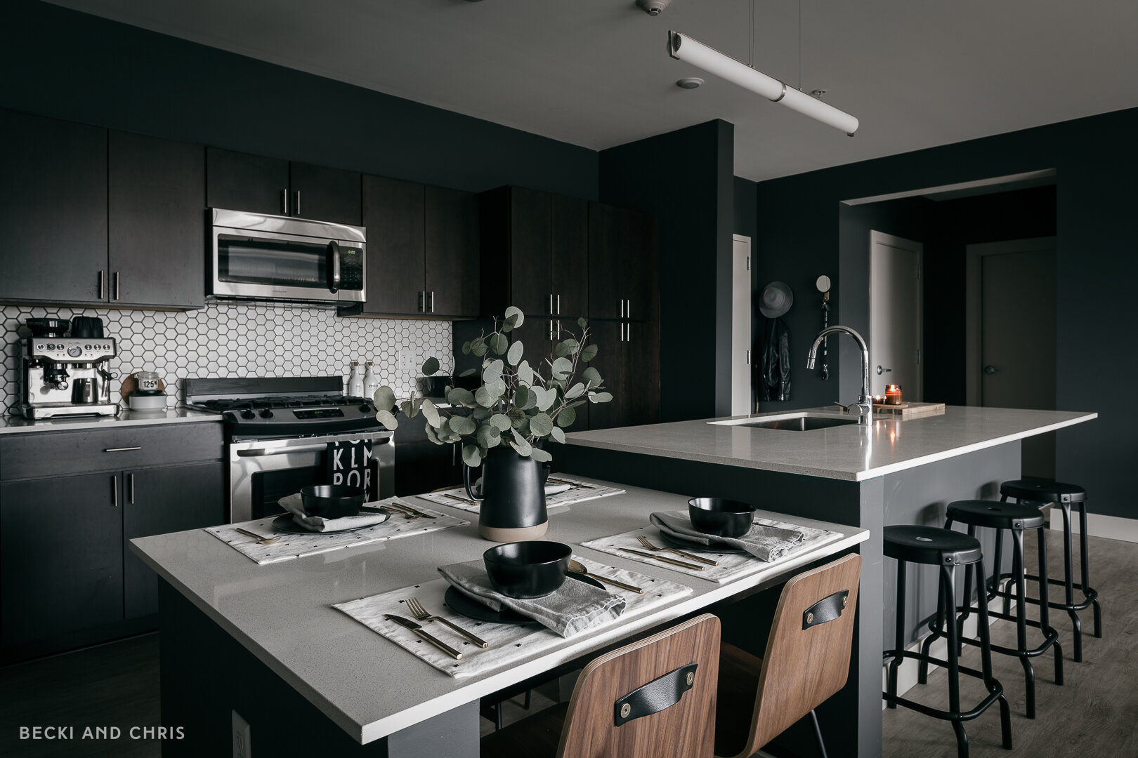
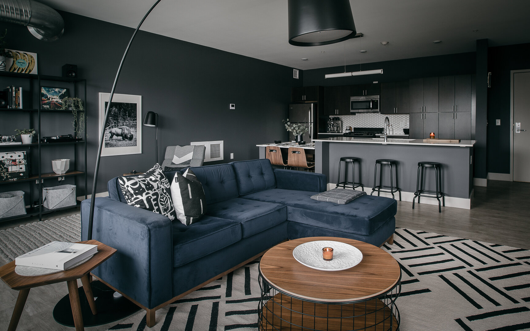
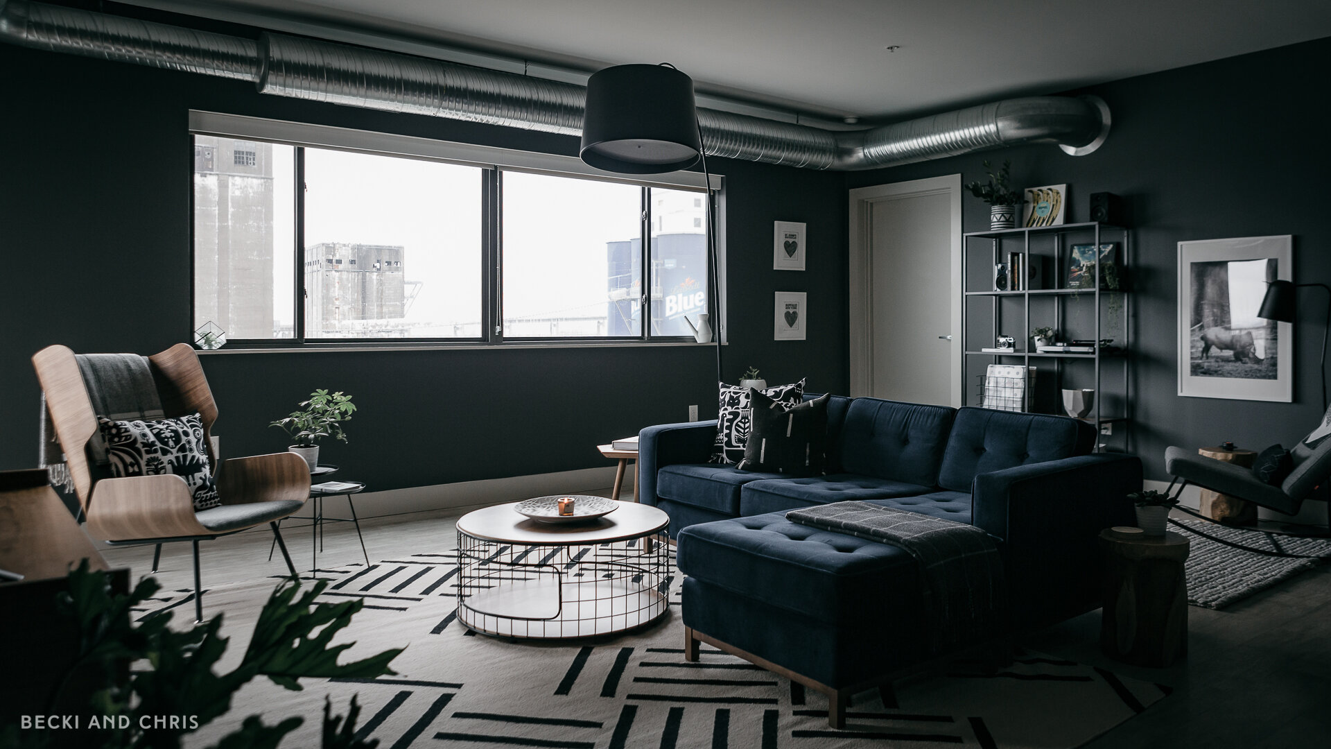
Clearly we LOVE a dark wall! We painted out this entire space in one of our favorites Gray by Benjamin Moore. We used this in our St. John’s house and found it to be dark and cozy without being TOO dark. We weren’t the biggest fans of the cabinets though, so painting the space out dark made them disappear, or be a bit less obvious anyway. We also got permission to paint over that ugly turquoise island, we decided to go dark on that too!
We don’t entertain very much so we didn’t feel the need to have an additional dining space. We had enough chairs and stools to host 7 (weird number) so we broke up the living space into two functional living spaces.
The couch/TV Area
Instead of pushing all the furniture up against the walls, we used it to create two dedicated spaces in the large open living area. We turned one side of the space into the couch/TV area which is anchored by a larger 8x10 rug.
Lounge Area
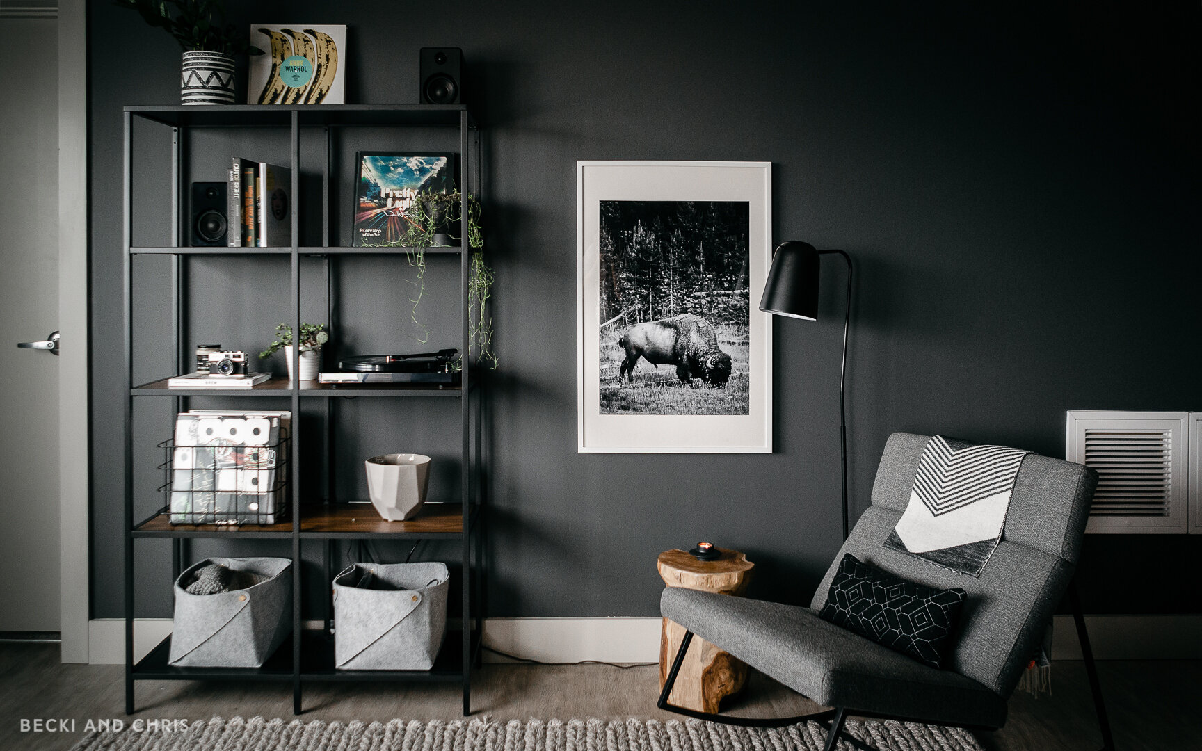
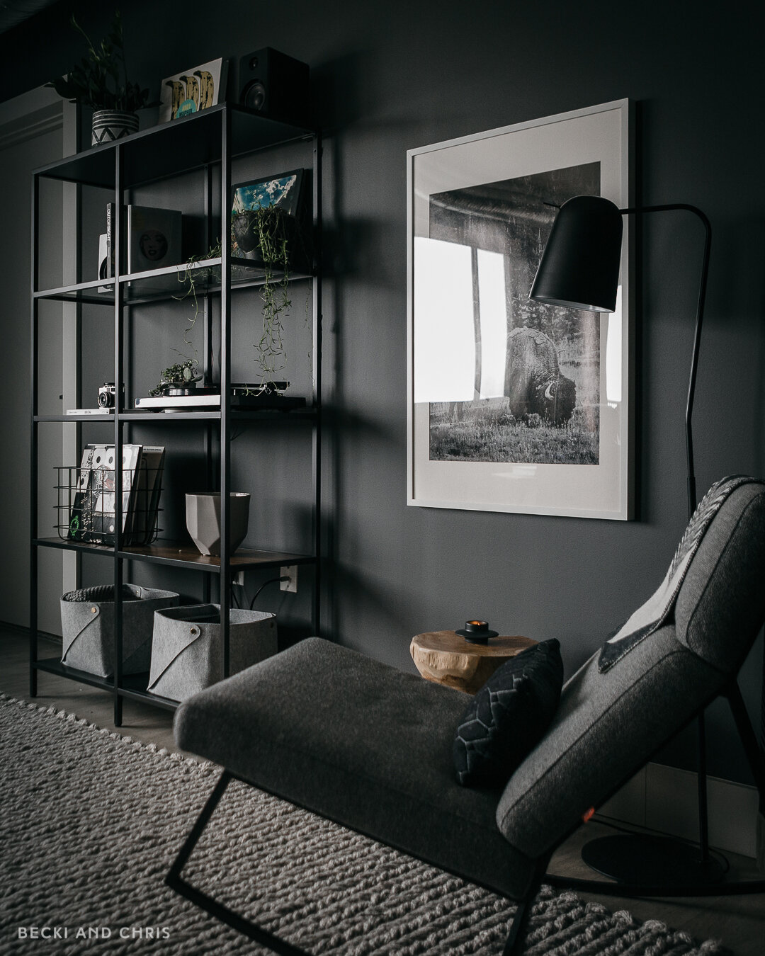
On the other side of the room behind the couch we created a lounge area with a bookshelf, rocking chair and floor lamp. This side gave us another place to sit that wasn’t the couch. The apartment was large, but not quite large enough to be able to escape and relax in a new space. Creating two spaces in one allowed us to enjoy a little variety without needing extra rooms.
The rocking chair corner might have been one of my favourite spots to sit with a cup of coffee and my laptop. It was a good change of scenery from working in my office. It was also fun to look at that Bison print, a photo I shot in Yellowstone during our long haul trip to Vancouver which hung above our bed in our previous place. A photo of a Buffalo hanging in Buffalo, weird!
If you have a big space, don’t be afraid to float your couch in the middle of your room or use your furniture to make “rooms” or “zones” within a larger space. One of the biggest mistakes I see people make is they get into a larger space, they push all their furniture up against the walls and then their coffee table and rug float awkwardly in the middle of the space. DON’T DO THIS! Use a rug to anchor a moment in a room and work around that.
While we didn’t feel the need to have a large dining table, we could have swapped out the lounge space for a dining room and that would have worked too!
You can see more about how we planned the space here:
WALL COLOR
We painted the walls our favourite moody gray called…Gray by Benjamin Moore LOL. It darkens up the space and makes it feel cozy while not being a suck hole for light.
Becki and Chris
Instagram: https://www.instagram.com/beckiandchris
YouTube: https://www.youtube.com/c/beckiandchris
Twitter: https://twitter.com/beckiandchris

